


How to choose the facade colour to match the roof, windows and fence
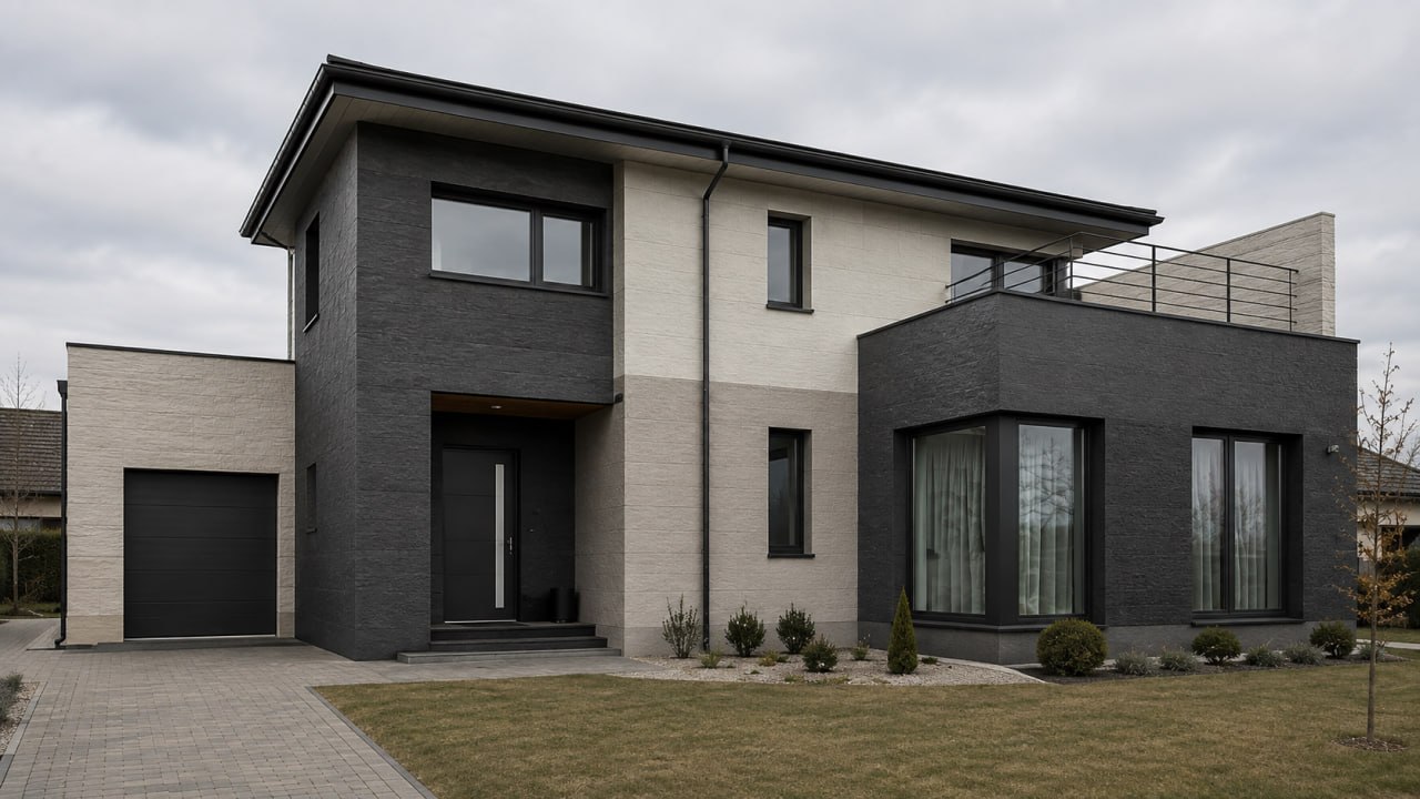
Four simple colour-pairing schemes, common mistakes and a mini-checklist for choosing a facade colour in harmony with the roof, windows, plinth and fence.
The facade colour should never be chosen in isolation from the rest of the house. Even the most beautiful shade can look wrong if it clashes with the roof, the windows, the fence or the plinth. A successful facade isn't just "I liked the colour" — it's a unified combination of materials in which everything looks balanced, elegant and logical.
To avoid mistakes, it's enough to use a few simple pairing schemes and to know in advance which solutions are better avoided.
Why the facade is chosen around the existing elements
A private house has several important visual anchors: the roof, the window frames, the gutter system, the fence, the gates, the plinth, the entrance door, the terrace or the porch.
If the facade isn't coordinated with these elements, the house feels incoherent: the roof in one style, the walls in another, the fence completely separate. That's why, before choosing a colour, look not just at a material sample but at the whole house. Flexible panels from the KORDEKO flexible stone range are easy to match in shade and texture with the roof, the windows and the plinth.
Scheme 1. Light facade + dark roof + dark windows
One of the most popular and safest combinations. It suits modern houses, classic villas and buildings with simple architecture.
- light beige facade + graphite roof;
- warm white facade + dark grey windows;
- light grey facade + anthracite roof;
- sandy facade + brown roof.
A house like this looks clean, contrasting and modern: the dark roof and windows create an outline, while the light facade makes the building feel lighter.
Scheme 2. Warm-toned facade + brown roof + natural fence
If the roof is brown, terracotta or another warm shade, choose the facade in a natural palette: beige, sandy, cream, warm grey, light brown or natural stone shades.
This option combines well with a wooden fence, brown gates, warm paving and a green yard. Avoid cold grey or very intense white without a reason — they can feel foreign next to a warm roof.
Scheme 3. Grey facade + graphite details
Grey can be cold, warm, light, concrete-like or graphite. A proven scheme: light grey walls, graphite roof, dark windows, a grey or black fence, and a plinth 1–2 tones darker than the facade.
So the look doesn't turn too "cold", add stone texture, warm lighting or wooden elements. We covered how this kind of finish keeps its colour over time in the article on flexible stone and colour fastness on the facade.
Scheme 4. A single accent colour
If you want an expressive facade, choose one accent instead of several colours. The accent can be the entrance zone, the plinth, the section between windows, the area under the roof, a vertical decorative element or the terrace zone.
For example: a light main facade, dark roof and windows, and the accent zone finished with a stone look. The house becomes more interesting without feeling overloaded.
How to choose the facade to match the fence
The fence often occupies a large visual area, especially if it's close to the house, so it shouldn't be ignored.
- dark fence → a lighter facade, so the home doesn't feel heavy;
- light fence → a more expressive plinth or an accent texture;
- wooden fence → a facade in a natural, warm palette;
- graphite or metal fence → shades of grey, white, greige and stone tones.
The plinth links the house to the ground
The plinth is the transition between the facade and the ground, and it needs to be practical and visually stable. Choose a shade darker than the facade, close to the roof or the windows, not too light, with a texture that hides dust and splashes.
A plinth that's too white looks dirty quickly; one that's too black highlights dust, water marks and efflorescence. Mid-tone stone shades are the most practical.
Common mistakes when choosing the colour
- Choosing from a small sample. On a large surface, the colour almost always reads lighter and more intense.
- Ignoring the roof. If the roof already exists, the facade has to work with it — not be chosen separately "because it looks nice".
- Mixing cold and warm tones without logic. A cold grey can look out of place next to a warm brown roof.
- Too many colours. For a private house, 2–3 decisions are enough: the facade, the plinth and one accent.
- Ignoring the windows. If they're dark, support them through the plinth, the gutters, the roof or an accent zone.
If the facade is insulated, choose the colour early
When facade insulation is being done, decide early where the different materials and shades will go: the layout, cutting, and the finishing of corners, plinth, window sills and decorative zones all depend on it. Colours chosen only during installation lead to accidental transitions and awkward junctions.
Mini-checklist before choosing
- What colour is the roof?
- What colour are the window frames?
- What colour are the fence and gates?
- Is a dark, practical plinth needed?
- Is there wood, metal or stone in the yard?
- Is the house's overall palette cold or warm?
- Where will the accent texture go?
- How does the colour look outdoors, in natural light?
A standardized shade catalogue such as the RAL system helps you pin down the chosen colour exactly and communicate it clearly to the installation team.
Conclusion
A good facade colour isn't a pretty shade chosen on its own, but a coherent combination of roof, windows, plinth, fence and landscaping. The safest schemes are built on 2–3 colours, natural tones and clear logic: a light facade, a practical base, controlled accents.
The KORDEKO flexible facade helps combine colour and texture into a unified composition — highlighting the plinth, the entrance zone or the sections between windows, while keeping the house's look coherent and modern.
Frequently asked questions
How many colours are enough for a facade?
Which plinth colour is the most practical?
How do I choose the facade if the roof is already installed?
Need advice on your facade?
- Get a free consultation for your project
- Find out which material suits your facade
- We'll answer all your questions and help you choose