


KORDEKO flexible facade: how to combine stone, brick, slate and wood textures without visual chaos
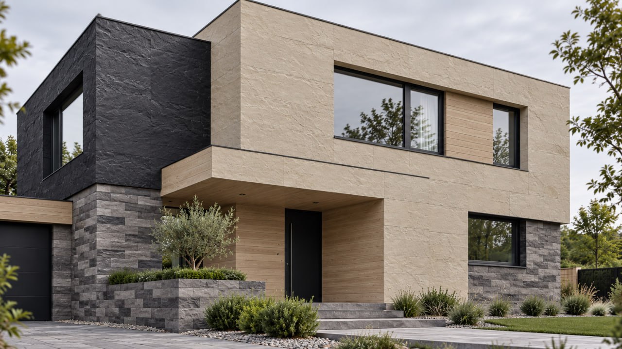
Stone, brick, slate and wood each have a distinctive appearance. Problems begin when all four textures are given equal visual importance.
The result can be an overloaded facade with too many colours, lines, dimensions and contrasts. However, by establishing a clear hierarchy of materials in advance, even four different textures can be combined into a cohesive architectural composition.
The main rule: do not give every material equal importance
One of the most common mistakes is distributing four textures across approximately equal areas. For example:
- one section of the wall is finished with stone;
- another section features brick;
- slate is used around the windows;
- another area is finished with wood.
Each material begins competing for attention. A much more balanced approach is: one primary texture + one secondary texture + small accents. For example, stone becomes the dominant material, wood adds warmth, and brick or slate is used only on selected architectural elements.
Stone as the foundation, wood as an accent
One of the most natural combinations is stone and wood textures. Stone can be used to finish:
- main exterior walls;
- the plinth;
- the entrance area;
- individual architectural volumes.
Wood texture can be reserved for:
- recessed entrance areas;
- terraces;
- balcony areas;
- selected vertical inserts.
Wood visually softens the appearance of stone, while the stone texture prevents the wood finish from looking too plain.
Why brick should be used in moderation
Brick texture creates a strong visual rhythm through its repeating horizontal lines. When applied over a large area alongside highly textured stone and slate, it can make the facade look too busy. Brick therefore works well for:
- highlighting the entrance area;
- inserts between windows;
- finishing an individual floor;
- small architectural volumes;
- accents around doors.
Colour selection is particularly important. Combining red brick, grey stone, dark slate and warm-toned wood may introduce too many competing shades.
Slate: a material for strong accents
Slate has a pronounced relief and a distinctive natural pattern. As a result, it does not need to cover a large surface to make an impact. It can be used on:
- the plinth;
- a single accent wall;
- columns;
- fireplace areas;
- entrance areas;
- individual vertical sections.
If slate is already used on the lower part of the house, the other materials should generally have more restrained textures.
How to distribute four textures
An effective combination might look like this:
- Main surface: stone. It establishes the overall character of the facade.
- Accent: wood. It introduces warmth and breaks up large stone surfaces.
- Small area: brick. It creates visual rhythm and an architectural accent.
- Minimal area: slate. It is used wherever a specific architectural detail needs emphasis.
This approach gives each material a clear purpose rather than simply filling empty spaces on the facade. Facade-and-plinth pairs can be tried out in advance in our texture combinator.
Why colour matters more than the number of materials
Even three or four different textures can look harmonious when they share a consistent colour palette. For example:
- light grey stone;
- grey-brown brick;
- graphite slate;
- natural wood.
All four materials have different textures, but their colours visually connect them. In contrast, combining:
- red brick;
- yellow stone;
- black slate;
- orange-toned wood
may create excessive contrast. It is therefore better to establish the colour palette first and decide how to distribute the textures afterwards. How to choose a shade to suit the roof, windows and fence is covered in our article on facade colour; the chosen shades are easiest to pin down for everyone on site with the RAL scale.
How repetition connects different materials
There is a simple architectural technique: repeat the same material or shade in several locations. For example, the colour of the plinth can be repeated:
- around the entrance;
- on a column;
- near the terrace.
Alternatively, the wood colour can be repeated:
- on the facade;
- on the entrance door;
- in terrace elements.
This makes individual areas feel like parts of one cohesive building.
Why horizontal and vertical lines also matter
Different textures create different visual directions. Brick emphasises horizontal lines. Wood can create a vertical rhythm. Slate often introduces a more irregular natural pattern, while stone can form large, calm surfaces.
Placing all these directions next to each other without a clear plan can make the facade visually complicated. It is therefore worth deciding in advance:
- which elements emphasise the building's height;
- which elements visually widen the building;
- where one material ends;
- where another material begins;
- whether material transitions align with windows and architectural features.
Why you do not have to cover every wall
This is one of the most important design principles. Sometimes a facade looks more sophisticated when fewer materials are used. For example:
- 70% calm primary finish, the dominant material;
- 20% secondary texture, supporting the main composition;
- 10% distinctive accents, highlighting selected architectural features.
These percentages are not strict rules. The principle is that one material should visually dominate while the others support it.
How to use KORDEKO flexible tile
KORDEKO flexible tile (PletaFlex) makes it possible to combine different stone, brick and other textures on the same building. This is particularly useful when individual architectural areas need to be highlighted without switching to heavy cladding materials. For example, different areas of the same house can have separate functions:
- main walls: stone texture;
- plinth: a darker texture;
- entrance: brick texture;
- terrace: wood texture;
- individual architectural features: slate texture.
A consistent colour palette can serve as the unifying element. All of these textures go onto the same substrate, including over an insulated facade when Facade insulation is carried out.
Where visual chaos most often occurs
Too many colours
Four textures can still work together. Four textures combined with seven different colours are much more difficult to balance.
Too many small inserts
When the material changes every few metres, it becomes difficult to identify the main architectural accent.
No logic behind material transitions
If brick ends in the middle of a wall and slate suddenly appears next to it, the composition may look random.
Every material has the same strong contrast
A facade needs visually calm areas. They give the eye somewhere to rest.
A simple process for choosing materials
Before placing an order, it is worth following four steps:
- Choose the primary material. It should cover the largest part of the facade.
- Choose one secondary material. It should create contrast without competing with the primary material.
- Decide where to use a third texture. Include it only if it genuinely contributes to the architecture.
- Use the fourth material as a small accent. If the facade looks better without it, there is no need to include it.
Conclusion
Stone, brick, slate and wood textures can all be combined on the same house. The problem is not the number of materials but the lack of a clear visual hierarchy.
One material should form the foundation of the design, the second should support the composition, and the remaining textures should be used selectively. A consistent colour palette, repeated shades and carefully planned material transitions bring different textures together into one cohesive facade.
KORDEKO flexible tile makes it possible to create such combinations on a single house, highlighting the plinth, entrance area, windows, terrace and individual architectural elements without visually overwhelming the building.
Frequently asked questions
Can stone, brick, slate and wood be combined on one house?
In what proportions should facade textures be distributed?
What matters more, the number of materials or their colour?
Need advice on your facade?
- ·Get a free consultation for your project
- ·Find out which material suits your facade
- ·We'll answer all your questions and help you choose